Questions about this campaign?
Please contact Heidi Meiland using this form.
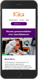
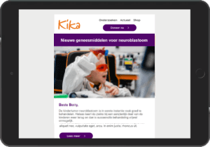
We developed a new email template for KiKa (Children Cancer-Free Foundation). The technology and design were totally out of date. KiKa is very happy with their new template. This gave KiKa’s email strategy, which we have been supporting, a tremendous boost.
The most important points when developing the template were creating a good user experience, improving the conversion path and ensuring that the template could accommodate the newest technology. This will ensure a greater reach, more engagement and a better conversion, which is evident in longer reading times, for instance, and higher click-through rates. KiKa can use the template for all its target groups – from leads and prospects to faithful donors, campaign subscribers and volunteers. Consider for example:
The template’s flexible design makes it easy to use for different kinds of mailings. We devoted much attention to this during the development process. Every email can be composed easily thanks to the block structure with layout elements in the house style. It is possible to create endless variations using the blocks, call-to-action buttons and attention-grabbing links. Fixed elements in the template guarantee a clear layout, navigation and (top)menus. We also ensured that the design matched KiKa’s other marketing communications, such as their website and campaign platform.
Every email is mobile friendly and compatible with all mobile devices thanks to the responsive web design. With updated HTML codes, we have ensured that it is smaller in size. Images have also been compressed as much as possible. In order to get rid of small bugs in the system, the template was extensively tested on different devices with all popular browsers. We built the template using DeployTeq software. DeployTeq makes it possible to create a complete customer journey using segmentation and personalization. Because we also take care of KiKa’s database management, we can fully automate the data flows.


iPhone screenshot iPad screenshot

Over 550 children in the Netherlands are diagnosed with cancer every year. Unfortunately, cancer is still the number one killer when it comes to childhood disease. Currently, three in four children with cancer recover, but KiKa (Children Cancer-Free Foundation) wants them all to be cured. In order to achieve this goal, much cost-intensive research is still needed. KiKa is the only charity in the Netherlands that funds research into all types of childhood cancer.

Learn from three real-life examples
Today, you watch a video on Facebook about animal suffering. Tomorrow, you’ll see an ad for an animal rights charity to sign a petition, download a brochure or take a quiz – something the organization can use to get your contact details. In this way, you have become a lead. The charity can contact you with a request, an offer or a service.
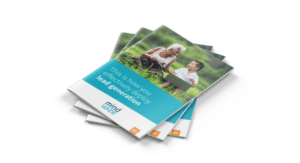
In this whitepaper, we will highlight a few real-life examples of online lead generation for you.
Please contact Heidi Meiland using this form.
Would you like to receive regular tips and news about donor recruitment and retention?
Subscribe to our newsletter now!