Subscribe to our newsletter!
Would you like to receive regular tips and news about donor recruitment and retention?
Subscribe to our newsletter now!
We do so much online. But direct mail is still an effective tool that every fundraiser needs to have in their arsenal.
And an effective direct mail campaign begins with the envelope.
Your envelope has just one goal: to be opened!
“If your envelope is not opened,
it doesn’t matter what other brilliant ideas you’ve come up with.”
There are a few points we could highlight.
But the biggest one by far is: Less is more. Instead of thinking about what you can add. Think about what can be left out. Putting the offer or the giveaway on the envelope is not the best way to elicit a response.
Here are six tips for an effective envelope.
Your best chance of having the envelope opened.
Instead of thinking about what you can add. Think about what can be left out. Putting the offer or the ask on the envelope is not the best way to elicit a response.
Don’t give much away, sometimes one word will do, such as [Research], [Urgent], [Private]. Or the greatest mystery of all: a white envelope.
In the majority of tests, a white envelope wins over an envelope with a printed design.
Your biggest mystery: a blank envelope.
Start with a white envelope: only add extras if they genuinely add something.

I will open something that is for me.
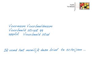
Denk aan handgeschreven adresgegevens. Getypte tekst. Handgeschreven omcirkeling, tekstjes. Alles wat lijkt alsof het er persoonlijk is opgezet. En alles wat lijkt op persoonlijke post voor mij.
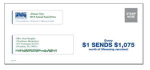
People like a good deal. This could be a matching gift (your donation will be doubled). Valuable medicines that could be sent. A full plate of food for just €1.99.
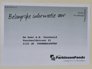
Post that is important is not ignored.
An envelope from a scientist. An envelope with an ‘important’ design, ‘Express envelopes’. Text such as: ‘For the attention of’. ‘Personal invitation for’.
Regularity leads to lower responses. If people get used to things, it is easier for them to ignore them. So change your envelopes and don’t send the same one for every campaign. Surprise. Change the size, color, design, postage stamp, type of paper.
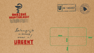
Too much design rarely wins over a subtle envelope with just copy. I think this is because people are already used to receiving so much “designed” mail from commercial organizations. An envelope with too much design will quickly be categorized as advertising. And too much design is also often an indication of excessive information.
Finally, the direct marketing disclaimer.
Exceptions confirm these rules. And you’ll find this out by testing.
Good luck with your fundraising!

Team Mindwize
Want more tips about envelopes? Find them here.
Based on our 30 years of experience, we have written a practical guide for fundraisers: ’99 Tips for more Donations’. We explain clearly which techniques positively influence the response.
Download our 99 tips and read more about:

And much more…
This book is a practical guide for all fundraisers. Download the book and apply the tips today!
Would you like to receive regular tips and news about donor recruitment and retention?
Subscribe to our newsletter now!