Subscribe to our newsletter
Get fresh insights to help your charity grow.
Do you want to make effective use of your fundraising website? In this article, we will give you 5 valuable tips that will help you make the most of your website. With the right strategies and tactics, you can boost your online fundraising activities and generate engagement from potential donors. Which tip will you apply first?
Online lead generation will help your charity grow. It will increase your email address list and lead to more monthly donors. If you have an interesting brochure or an important petition that people can sign, you already have a solid foundation for lead generation.
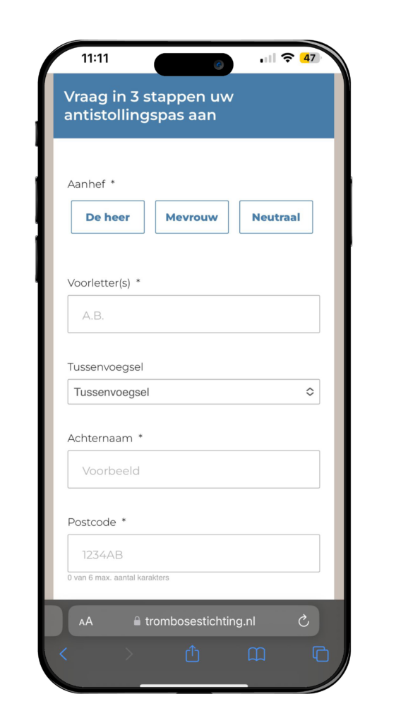
As an example, look at the online fundraising of the Dutch Thrombosis Foundation. They generated their online leads with the help of an anticoagulation pass. Anyone who takes blood thinners can request the anticoagulation pass for free. With the anticoagulation pass in your wallet, you can show people that you take blood thinners in case of a medical emergency anywhere in the world. This is important for medical personnel to know, so they can adjust your treatment accordingly.
We launched this campaign for the Dutch Thrombosis Foundation on Facebook and Google. By clicking on an ad, interested people were taken to a fundraising website where they could easily request their anticoagulation pass. We added their personal information to our database. This marked the beginning of an email journey and our colleagues from Socialcall could begin calling them.

The application form for the anticoagulation pass
Ideally, you want people to give you a (monthly) donation. For that, you will need powerful donation pages. How do you do that? First of all, you want a page where all you can do is make a donation. Leave out anything that might distract visitors from that. Secondly, it is important to inform people about why their donation matters. What is the urgency? What will you do with the money you raise? Who are you trying to help? All this must be made clear on the donation page.
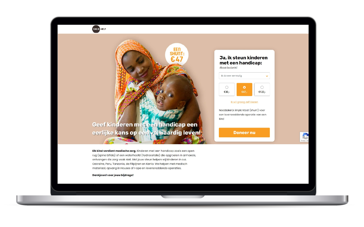
You must also make the donation tangible: “€47 pays for the shunt needed to operate one child.” Your donor now knows exactly what they are paying for. However, you should also give people the option to donate a different amount.
Lastly, it is important to split the donation form into several steps to make the process easy to understand.

Do you want a powerful donation page? Take a look at Child-Help’s example
Would you like to know more about effective donation pages and fundraising websites? Read this blog article with tips for a landing page or download this whitepaper with 99 tips for more donations.
Once people have made a donation or downloaded your brochure, it is important to keep them interested in your charity. The way to do this is with a strong email journey. This will keep people, who might not know anything about you yet, engaged and lets you build a relationship with them.
You can set up this journey however you like. Let’s say someone wants to know more about bequests and they request a brochure on your website. You send them this brochure by mail, along with an information letter. Next, you send them an email and follow up with telemarketing. It is important to use the same style of communication whenever you reach out to people, so it becomes recognisable for donors.
If you request the anticoagulation pass from the Dutch Thrombosis Foundation, you will receive an email about how to use the pass. Next, you will get an email that tells you more about the severity of thrombosis. Lastly, you will receive an email with a story from someone who has an anticoagulation pass, along with a call to make a donation.
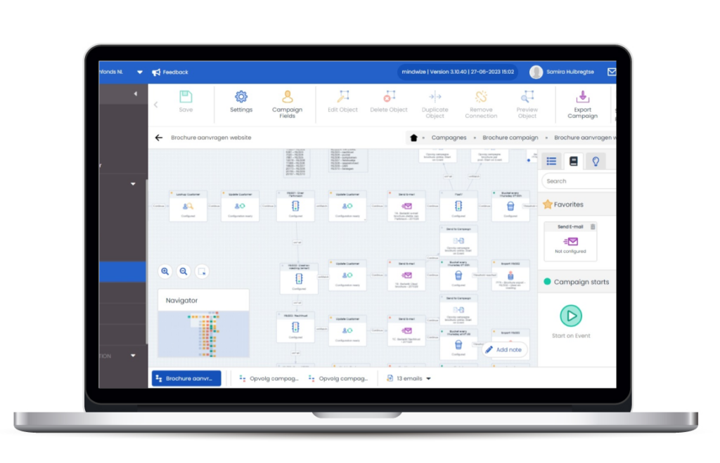
You can combine different topics in your email journey. If you have several brochures, for example, there is no need to set up a different journey for each brochure. We developed a single email journey for the ParkinsonFonds Foundation’s eight brochures that people can request as digital or physical copies.

A schematic overview of the ParkinsonFonds Foundation’s brochure campaign
People want to donate to people, not to a faceless organisation. Remember that when you are writing copy for your emails, landing pages and social media. Give the issue a face and make the solution tangible.
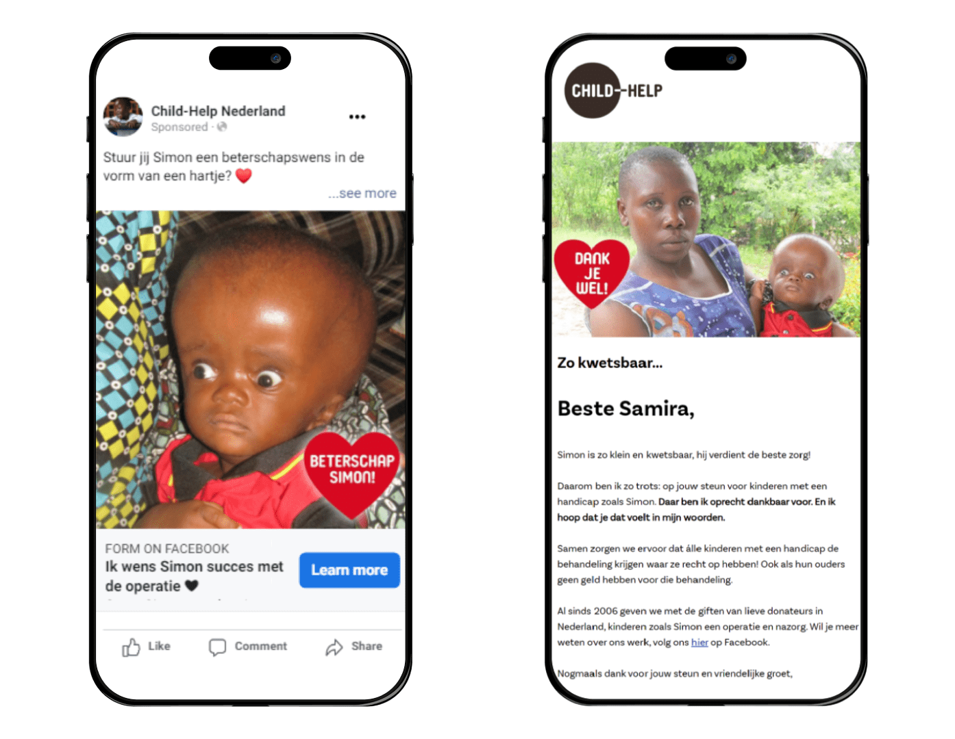
Instead of telling readers how many children need surgery, focus on Simon, the boy with hydrocephalus who can only hope that he can have his life-saving operation before it’s too late. By doing so, you turn a huge, abstract problem into a personal story that speaks to donors.

On Facebook and in their emails, Child-Help tells a tangible and human story.

Sustainable online fundraising is more important than ever. However, websites are hosted on servers that are located in power-guzzling data centres. That is not compatible with what your charity stands for. You should therefore have your website hosted by an organisation that uses green energy or offsets its carbon emissions without negatively affecting people in low- and middle-income countries. For example, we use Go2People, which runs its servers on 100% renewable energy and offsets all its carbon emissions, as the hosting provider for our own and our clients’ websites.
By combining these five tips, your charity is guaranteed to have a strong online position. Which tip will you use first? Let us know, we are happy to help.
Get fresh insights to help your charity grow.